PLEASE click the images in the overview, top of the page, OR scroll TO SEE DETAILS
ONE MUST DASH
AVON
CRABTREE & EVELYN
TY NANT WATER
MAMA MZUNGU
THE BODY SHOP
LOVE YOUR INNER SELF PROBIOTIC YOGHURT

ONE MUST DASH

AVON

CRABTREE & EVELYN

TY NANT WATER

MAMA MZUNGU

THE BODY SHOP

LOVE YOUR INNER SELF PROBIOTIC YOGHURT
ABOUT:
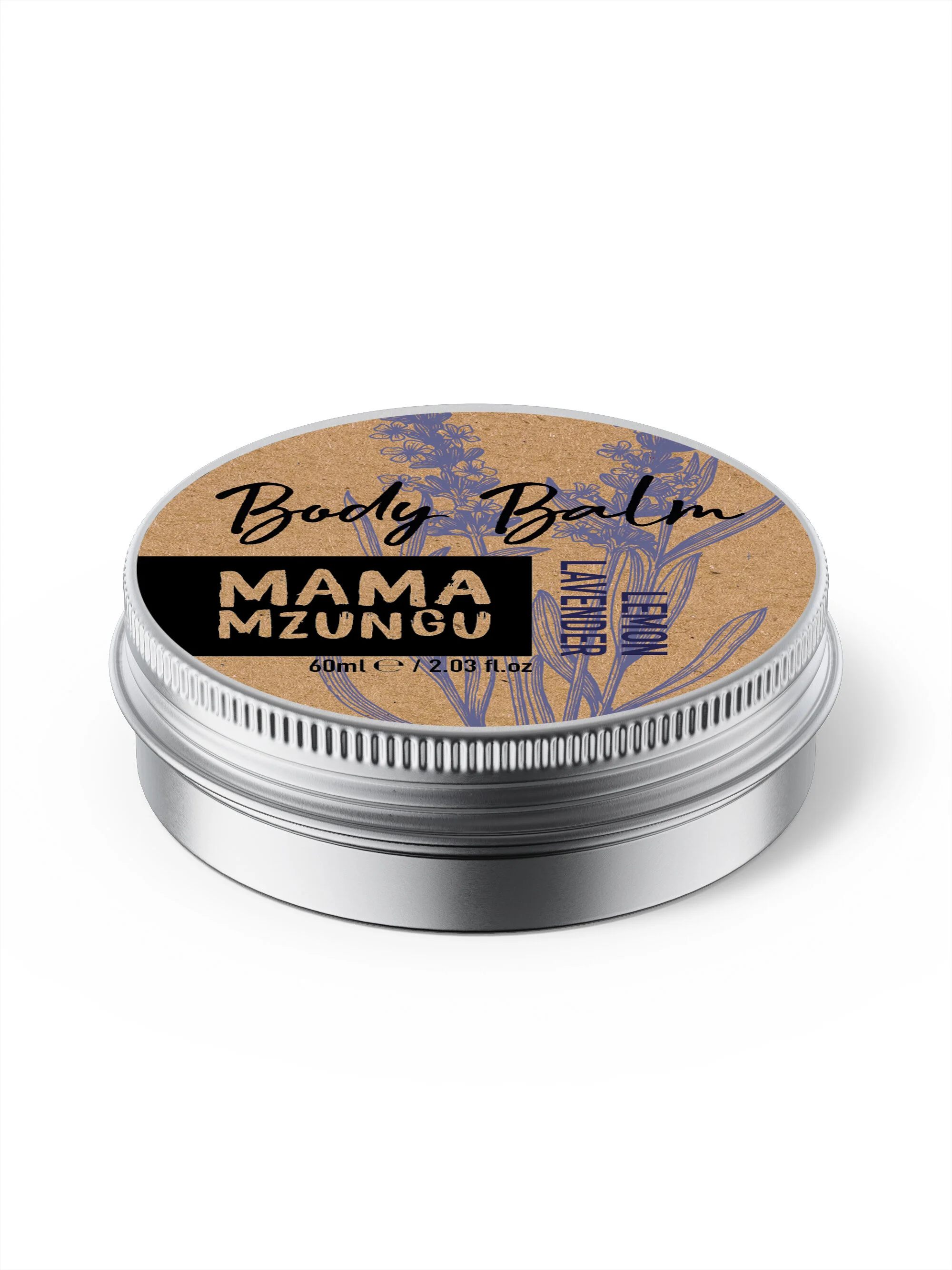
Women and children with Albinism are in a very vulnerable situation in Uganda (and other parts of Africa) due to stigmas, believing having sex with a young woman with Albinism will heal you, believing a body part of a child with albinism will give you wealth. The charity Mama Mzungu helps the women creating economic empowerment, a safe space and cracking down on the stigmas of Albinism.
Mama Mzungu is a natural brand which will give just not the women and children a future but also change people’s prejudgements about Albinism in Uganda.
CHALLENGE:
-A natural modern brand that works in the local markets in Uganda but also in an Eco shop in Europe or USA.
-Limited printing facilities and finances
-Easily be printed in Uganda with basic printing techniques
-Sustainability: as little packaging as possible, the packaging used is recyclable
-Easy to assemble and apply due to the women being visually impaired
The font was chosen to highlight the handmade and the connect to the African origin. We created a brand which is easy to apply, using a cost effective and natural material for the packaging.
Mama Mzungu is growing day by day, the latest success is a big order from Tradecraft, soon selling in Oxfam, British heart foundation and Martlets charity shops.


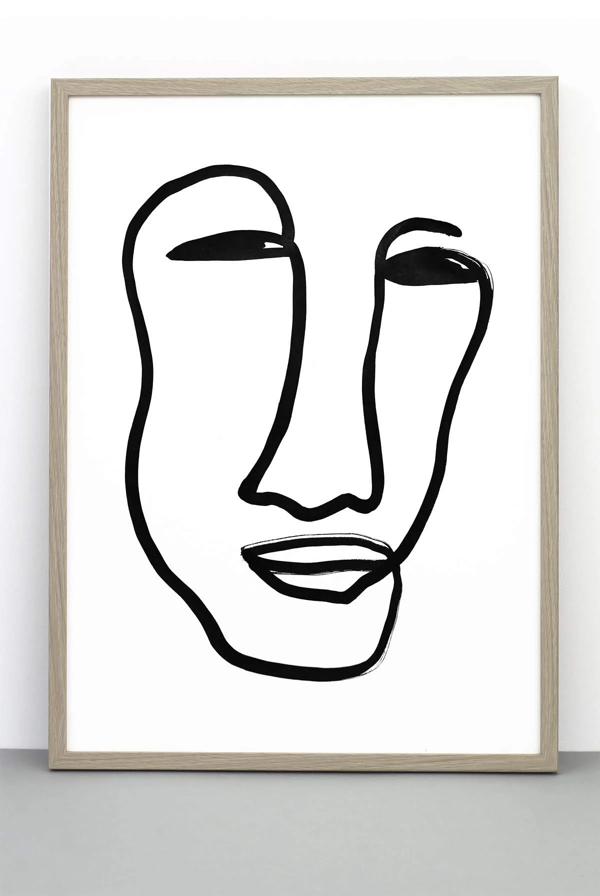
ABOUT:
I started the company One must dash Ltd 10 years ago, an interior accessories studio, mostly focusing on Scandinavian monochrome art prints. Following trends but always sticking to the black and white.
One Must Dash has demanded many skills of me - such as developing concepts and collections, designing products, production, leading & planning photo shoots 2 x large location photo shoots a year), online global marketing and taking part in trade shows.
I have directed and managed a talented team, to whom I owe much, as they’ve taken care of my brand and its’ high standards as if it were their very own. I connected and worked with talented outsourced professionals like photographers and stylists whom I still work with.
To start and successfully run a business has given me a broad experience and knowledge of which I get good use of when designing for other businesses.
KEY ACHIEVEMENTS:
• Covering over 150 wholesalers globally.
• Published in the biggest Interior magazines - Elle Decoration, Living Etc, Vogue, HouseBeautiful and Homes and Gardens.
• Achieved highest recognition of the print BLA which is still continually published and seen in interior magazines, blogs, and social media all over the world.


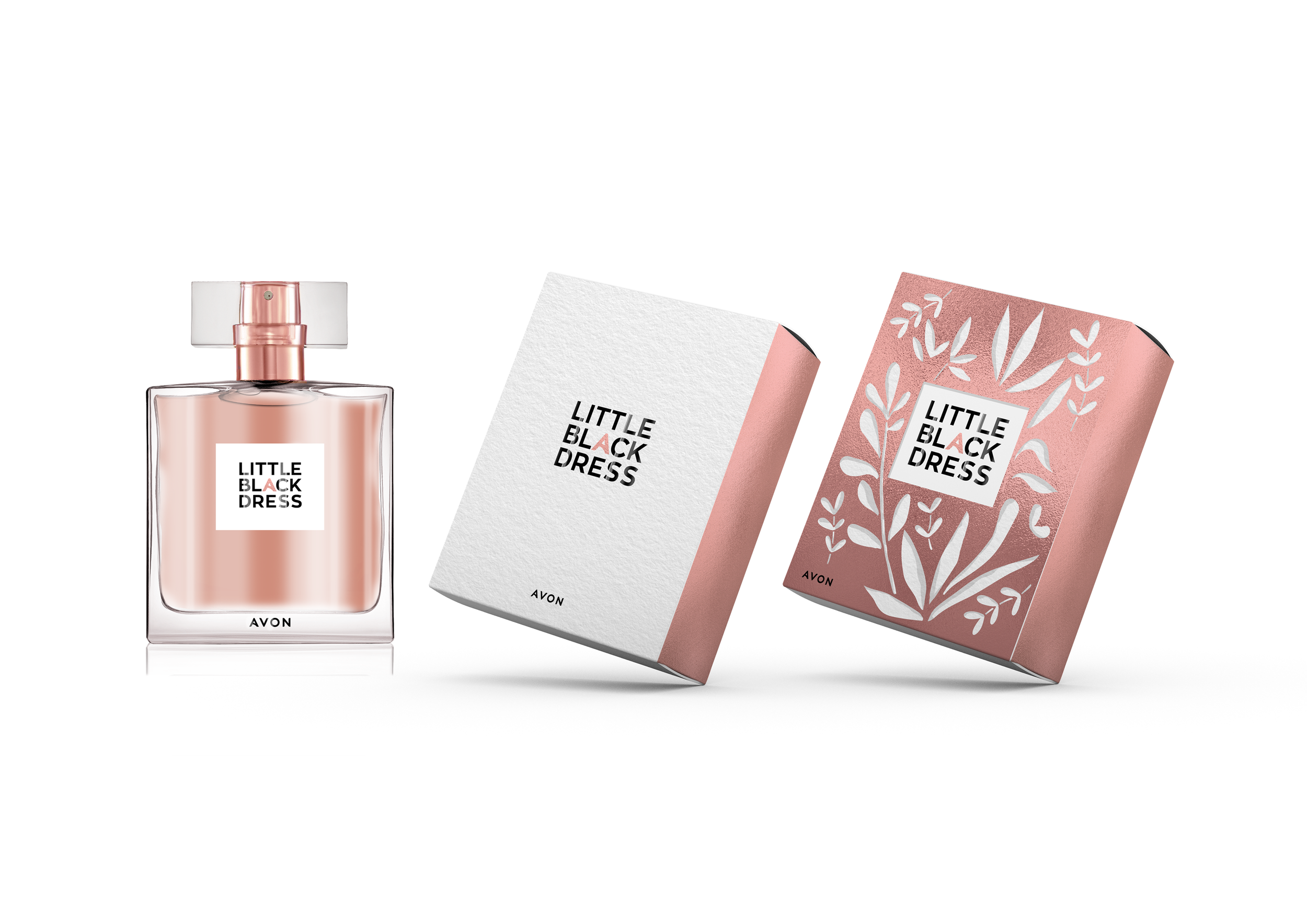
ABOUT:
Avon is a 130 year old beauty brand, started to help women get financial freedom. At the time being unique with its’ home selling and the famous phrase ‘-Ding dong, Avon calling’ they reached a huge audience.
Avon is in the process to broaden their target group, rebrand and are aiming to be a destination brand.
Today Avon is the biggest selling fragrance in the world.
CHALLENGE:
-Rebrand an existing popular fragrance called ‘Little Black Dress’
-Elevate the component and the packaging after previous cost savings
-Make ‘Little Black Dress’ feel like Avon’s Chanel no5, the go to fragrance for all occasion use
-Design to be changeable for ‘day and ‘night’ or limited edition varieties
GOAL FOR TRANSFORMATION:
- Connecting to Avon True brand while having its’ own identity as Little Black Dress
- Little Black Dress to be re-energised
- Little Black Dress to regain quality, design and fragrance experience (after previous production savings)
A concept which strongly supports the mother brand and making Avon a destination. A design aspiring to empower women, increase their confidence and always feel ready.


LOGO:
With inspiration from fashion logos like Sonia Rykiel and Day we create a timeless and classic logo.
By using the Avon font, Zona Pro, and highlighting the 'A' within LITTLE BLACK DRESS we get a strong connection to the mother brand and strengthening the customer’s perception of Avon.


Outer sleeve idea for a campaign or an event like Valentine’s day or a summer campaign
ADCEPT: Dare to be you, happy, colourful, playful. Strong women icons.

A concept with a strong editorial look, connecting not only with fashion magazines (messenger of trend setting) but also giving the customer a story that highlight quality ingredients and the long experience of Avon. The customers’ aspiration is to always be ready and to be admired.


LOGO:
Inspired by Fashion magazine logos you get an immediate connection to the ‘Little Black Dress’.
A classic regular weight aniqua, Bodoni, is used and a quality seal is added to talk about the ingredients and the long experience of Avon, on the cartons we have space to tell this story.


ADCEPT: Luxury interior environments, classic fashion poses. Strong women icons.

ABOUT:
Crabtree & Evelyn recently re-structured and re-branded to reach a broad audience, they now look very different compared to 50 years ago. They are still working with their heart values and aiming to connect people and cultures. Living by the motto “Explore everything. Keep the best.”
CHALLENGE:
• Working conceptually on Christmas gift packaging: one box to be filled with your favourites.
• The box to communicate any or many of the keys: Christmas, gifting or travelling
• The inner box to be used for future gift campaigns exchanging the outer sleeve.
I worked closely and successfully with Crabtree & Evelyn’s Global Creative Director carefully following the new branding and strategy. Here presenting some of the ideas and the final result developed by the in house team.
designed by Crabtree & Evelyn in-house team
ABOUT:
A complete re-brand of The Body Shop make up, with the brief to move to a more luxurious brand. Everything from components, iconography to a detailed brand guide line was thoroughly considered. The successful end result grew the sales to the double within a year.
THE ROLE:
Working in The Body Shop's Design headquarter in London as a Senior packaging designer I worked on most product ranges.
The role involved executing the entire design process for an array of packaging - like bath and body, make up, home fragrance, skin care and more. During my time at The Body Shop their complete re-brand was taking place and was incorporated in the packaging designs.


ABOUT:
The start up from Manchester, ‘Love your inner self’, is passionate about gut health. Their Probiotic Yogurt has won several food prizes.
’Love your inner self’ turned to me for a more prominent bottle design.
CHALLENGE:
-Finding a language for the brand: communicating gut health, connection with nature, yoga, meditation & well-being
-To create packaging that stands out on shelf among competitor yoghurt drinks
-Communicate all the benefits on front of pack
EXECUTION:
-With a tone in tone label this yoghurt will stand out on shelf among multicoloured competitors
-With the ‘gut bacteria’-pattern the main benefit is communicated in a decorative way
-Moodboard for future photo shoot, product photography, mood photography and ingredient photography was created to communicate the heart of the brand


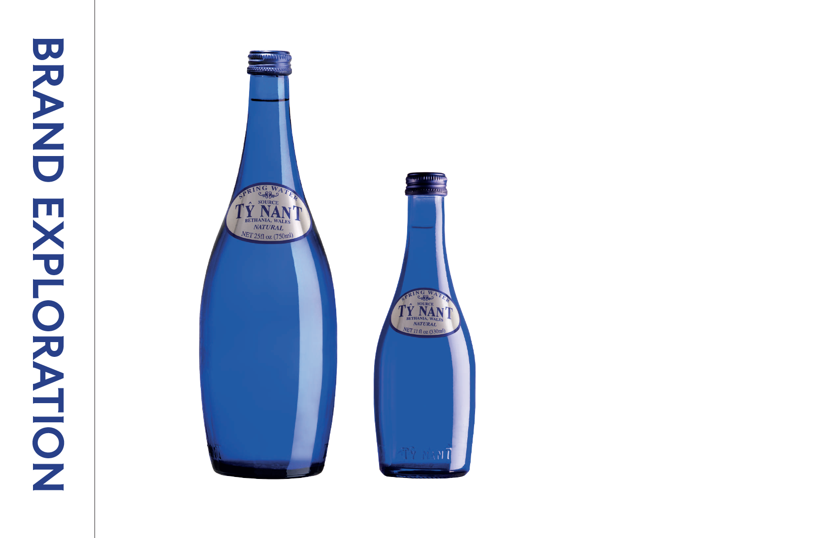
ABOUT:
Artesian water from deep beneath the Welsh Cambrian Mountains, declared to be the purest, most well balanced composition, ideal for drinking.
The blue bottle being the strong signature, the logo designed in the 80’s, now see a time for modernisation.
CHALLENGE:
• With the brand guide line pulling together all existing graphics and imagery and clarify wher Tynant Water is today.
• Suggestions of where to go next, logo to connect to Tynant’s heritage, update but also enable to live for many years ahead.